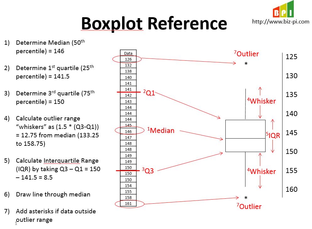
A Box and Whisker plot can bring clarity and highlights to your statistical data. We know that statistics assumes data points are clustered around a central value. When using a box and whisker plot, the ‘box’ contains and accents the middle half of these data points. It is a great way to graphically display variations in your data set. Because they are so easy to read, you can summarize data from multiple sources and display the results in a single graph. The box and whisker plot also allows for a better comparison of data from different categories.
Growing a Box and Whisker Plot
Understanding and creating a Box and Whisker plot is fairly straightforward. Start the process by organizing your data in numerical order (smallest to largest). Once the data is in proper order, find the median point of your data. The median point should divide the data into two halves. To divide the data into quarters, you then find the medians of these two halves.
Calculating Median Value
It is important to note that if you have an even number of values (so the first median was the average of the two middle values), then you include the middle values in your sub-median computations. If you have an odd number of values (so the first median was an actual data point), then you do not include that value in your sub-median computations. That is, to find the sub-medians, you’re only looking at the values that haven’t yet been used.
Example #1 (odd count of numbers): 2, 3, 5, 7, 9, 10, 15 (median is middle number 7)
Example #2 (even count of numbers): 2, 3, 5, 7, 9, 10 (median is halfway point between 5 and 7, which is 6)
Calculating Quartiles
Now, you have three points: the first middle point (the median), and the middle points of the two halves, or the ‘sub-medians’. These three points divide the entire data set into quarters, called quartiles. Then you name the top point of each quartile a ‘Q’ followed by the number of the quarter. As an example, the top point of the first quarter of the data points is “Q1”, and so forth. Note that Q1 is also the middle number for the first half of the list, Q2 is also the middle number for the whole list, and Q3 is the middle number for the second half of the list. You have created the “box” which contains the middle 50% of the data.
Next, we need to calculate the Interquartile Range (IQR), which defines the “whiskers” around the box. The whiskers extend 50% beyond the width of the box (1.5 x (Q3-Q1)) from the median on each side.
Any points in your data set that fall outside of the whiskers is considered an outlier, and is denoted with an asterick (*).
Let’s take a look at an example

Take Advantage of the Tool
The Box and Whisker plot is an effective and easy to read tool. It can summarize data from multiple sources and display them in a single graph! You can also use the Box and Whisker plot to compare data from different categories and thus, understand their relationships. This allows for a simpler decision making process.


No responses / comments so far.