My daughter recently turned 10 years old. So, because her friends have email and communicate via email, I recently helped her obtain an account. In the process, we both learned something very important about abstract ideas and the icons we use to visually represent them.
[contentblock id=37]
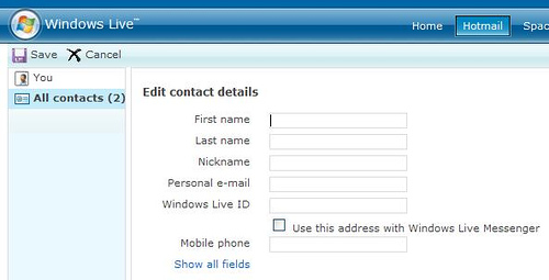
My daughter attempted to create a “Contact List” of people and their email addresses — mainly family members that she would like to email with. As she created a contact, she didn’t know and couldn’t find a way to “Save” the contact she just created. Here is what the user interface looked like:

Notice the “Save” button in the top-left corner? Yes, it does say “Save”, but my daughter didn’t see it. She, then, asked a very good question: “daddy, what’s the square thing next to the ‘Save’ button?” It dawned on me that she is part of a generation that has actually never seen a Floppy Disk. Yes — Floppy Disk — remember those?
A Dead Visual Representation of a Simple Idea
The actual gesture of “Save” work or an action is simple. But, what made the work confusing and difficult is the icon used to represent the idea. If the visual representation of the idea doesn’t make sense to the user or customer, then you introduce confusion, complexity, and eventually that customer might stop using the product or service.
Reflection
Representing abstract ideas, actions, or status with effective visual management is plain good ‘ol management. In doing that, we must make sure that the icons we use to represent our ideas have to be relevant to the audience. There is a growing generation of humans that have never seen a Floppy Disk or know what one is.
Be relevant; Connect; Be Accessible; Be Simple; Create Awareness — obeying these principles in visual management will enable the audience to better UNDERSTAND and obtain MEANING from your work.
Don’t go the way of the Floppy.


A well documented observation! and a really really interesting one. When thinking about usability we think about making the fonts bigger for the older crowd but never thought about the youngest users who are making their steps into the online world..
Wow. Yeah. She has never seen a typewriter, doesn’t know what “carriage return” means, and although she might say “dial the number” would likely have no idea how to actually operate a phone with a dial.
Information without context to the target audience is just noise, and the noise can even obscure the intended message.
What is even more interesting is that, perhaps, it shows just a little of the aging going in inside Microsoft itself. No one there questioned the icon.
Question: Given that “Save” is now more abstract than physical, what SHOULD the icon look like?
I wrote about this recently too:
http://www.bloglobyte.com/vintage-computing/the-floppy-is-actually-dead-but-hasnt-really-gone-away/
And as Mark said – “what *should* the icon be?”.
Maybe there shouldn’t be an icon.
And while we’re at it, I’m ready to complain about the new “stop” icon in the latest version of IE. The “X” was used as “close” then an “x” with a curved tapered corner came to mean delete. And now they overloaded the straight cross with “stop”. Ugh!
Maybe I’m smarter than a 5th grader… but I’m obviously also a lot older.