 Do you remember the Barack Obama “Yes We Can” speech? Yes, it was very powerful. Now imagine if it were a PowerPoint Deck – all the power and emotion is removed.
[contentblock id=37]
I once received a powerpoint presentation from a colleague; in the business world, powerpoint presentations are often amorously called “powerpoint decks.” Well, this deck was a huge one — 80 pages long. And, no, I didn’t read it, not one single page of it.
I am a huge fan of Edward Tufte. In his book, The Cognitive Style of Powerpoint, he explains why the widespread use of powerpoint isn’t good for any of us. He argues the following:
Powerpoint has a pushy style; it elevates format over content, turning once-informative work into a sales pitch. The result is dominance over your audience. One element that is particularly disturbing is the emphasis on byte-sized consumption: instead of writing in complete, coherent sentences, Powerpoint encourages infomercial type language and scattered thoughts.
In terms of content, Powerpoint allows ~40 words per slide; with so little information per slide, the result is the need for many, many slides — hence, the term “Deck.” Moreover, because presentations are sequential and stacked in time, it’s difficult to understand and find relationships. According to Tufte, visual reasoning works more effectively when relevant information is shown side-by-side. This is especially true when data is involved — which usually covers most business and technology presentations — because a fundamental analytical act is to make comparisons. It is difficult to make comparisons when a deck is sequential; it is better to have handouts so that the audience can compare data from one slide with another slide at their own convenience. What about placing several charts on one slide, allowing for comparison on the same slide? This can be done, but it’s difficult since there is so little space on a slide.
Continuing, Powerpoint encourages simplistic thinking; hence, content is compromised, which is very disrespectful to the audience.
Tufte concludes that presentation failure and audience boredom is a problem of content failure, not a decoration failure. If the integrity of your data is suspect and the way you present your data is over-bearing and not relevant, no matter how many clip art images or fancy colors you use will save the presentation — it’s a content failure; more decoration won’t save it. He further says that Powerpoint doesn’t respect the audience, but instead seeks to dominate them; it doesn’t encourage conversation or convey knowledge.
I am a huge fan of Edward Tufte. I agree with most of his points against Powerpoint; I do think he’s a little intense about the whole thing, but I do agree that, in terms of Powerpoint as a tool for conveying knowledge and the visual display of quantitative information, Powerpoint is a bad vehicle to use.
An Example of an Effective Display of Quantitative Information
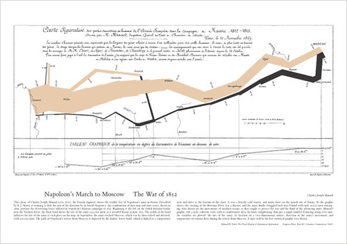
A wonderful piece of both art and mathematics is Charles Joseph Minard’s map that portrays the losses suffered by Napoleon’s army in the Russian campaign of 1812. This map is beautiful and informative: it shows 6 variables plotted in a most informative and elegant way.

Beginning on the left at the Polish-Russian border, the grey band shows the size of the army as it invaded Russia in June 1812. Napoleon started with 422,000 men and finally reached Moscow with 100,000 men. The black band shows the army’s retreat from Moscow, finally making it back to Poland with 10,000 men. This black band is linked to the temperatures and dates at the bottom of the map.
Conclusion
What once began as a piece against Powerpoint is ending as a piece about information architecture, design, and information theory. Tufte has influenced many areas of mathematics, design, and industrial engineering. Check his works out if you haven’t yet. You’ll be better for it.


Nice work Peter. I have always hated bullet points. Too bad that we feel the need to dumb down content for our audience. But, look at our news programs. Everything is a sound byte and in-depth reporting has gone by the wayside.