The Toyota Production System makes effective use of visual cues to mark location in time and space, boundaries, and to answer the question “How am I doing” in a production setting. Visual Cues are a simple but effective mechanism. Visual Cues are incredibly elegant and simple.
[contentblock id=37]
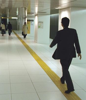
The assumption — and, what empirical evidence supports — is that we react automatically to objects and spaces that we encounter. The picture below is taken from the book Thoughtless Acts?: Observations on Intuitive Design — a highly recommended book:

Was the yellow line designed to encourage travelers to walk on its path? Was this an unintended consequence? In either case, we learn something substantial from the picture: people react to and adjust to their surroundings.
What types of visual cues cause you to react? What types of visual cues could you design that encourage the desired reaction from your audience?
More articles on Genchi Genbutsu and Ethnography?


What a fantastic piece of visual management. As a keen runner it reminds me of the white line I follow on marathons (http://tinyurl.com/ytowxc). Once I go into the running zone I tend to focus on the next 10 meters in front of me and stick to the line religiously. Just as well really; my sense of direction is lousy!
Rob
Look closely at the yellow “line” – it’s meant to be the yellow brick road from Wizard of Oz, obviously!! Possibly to remind people they aren’t in Kansas anymore 🙂
Cheers.
p.s. Love your blog.
When you spend any time at all pondering website usability, you realize that the entire web presentation is about getting the user to respond to visual cues. Click here for a menu, click here to submit your search query. This text is a link, this isn’t. We’re programmed to respond to red as danger / caution / stop. On a subconscious level, we’re programmed to respond to combinations of red, yellow, and orange with hunger. If you’ve never heard this before, look at the logos for McDonalds, Wendy’s, Burger King, KFC, etc. Wide, white bars across a pedestrian walk-way tell us where to cross, and if you watch someone start away from the bars, they’ll gravitate towards them by the time they reach the other side. We are SO programmed to respond to our environmental visual cues, it’s hard to recognize where they all are in our daily lives. I’d love to be part of a social experiment where we could change all the visual cues and see how people make mistakes and then re-learn their environment….
Having lived there for a total of over 11-1/2 years, the yellow line in public places is omnipresent in Japan (and likely other locations). It is there for blind people with a cane to “see” (feel) their path as they are walking on sidewalks and in railway stations to make sure they safely get from point to point.