As opposed to a Pareto, where the picture of the data shows a nice stratification and separation in the data, a Flateto is exactly the opposite: the visual picture is one where there is no separation — all the bars are of equal length. Essentially, a Flateto doesn’t tell us where to spend our time or energies.
Below is a good example of a Pareto — the exact opposite of a Flateto:

The above picture shows that the majority of the processing time for a process was being spent in travel.
A Flateto, on the other hand, would have showed that processing time are roughly the same across all category types. Indeed, a Flateto doesn’t tell us much or help us focus on the right things. Whereas, the Pareto above tells us that if we were to reduce processing time for the process above, then we ought to take a serious look at the travel time category because, most likely, any improvements in that category would yield us and the team bigger results and ensures that we are focusing on the right category.
The Pareto
The Pareto Principle was named after an Italian economist who discovered that 80% of the wealth in Europe was concentrated in 20% of the population. This discovery is also known as the 80/20 rule or the Law of the Vital Few. The Pareto Principle is a phenomenon that finds application in many places, such as software engineering, quality, manufacturing, word-of-mouth marketing, human resources, and government; the 80/20 rule was also popularized by the book The Mckinsey Way as a principle by which Mckinsey consultants follow to solve client problems.
A result of the Pareto Principle is the Pareto Chart. The Pareto Chart is used to graphically summarize and display the relative importance of the differences between groups of data, or to visually represent the Vital Few versus the Trivial Many.
You can create a Pareto Chart in any statistical tool such as GNU Plot, MatLab, Mathematica, Stata, SAS, or MiniTab. For our example, I’ll show how to create a Pareto Chart in Excel.
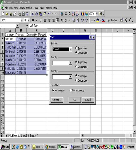
To create a Pareto Chart in Excel, setup a spreadsheet such that the first column contains the categories of your data, the second columns, percentages of each category, and the third column cumulative percentages of each category. The example below represents data collected on the number of citations issued by police for various violations (Category) in a particular intersection. Overall, 300 tickets were issued for various traffic violations. The percentage of tickets issued for each violation and the cumulative percentage of tickets issued were calculated and entered into an Excel spreadsheet. If the data is not sorted from high to low, then sort the data from the highest percentage to the lowest. The sequence for sorting is Data, Sort, Percent, Descending.

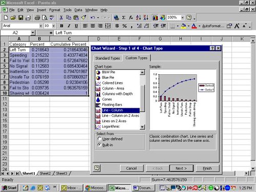
Then, highlight Categories, Percent, and Cumulative Percent Columns. Go to the Chart Wizard, select Custom Types and select Line-Columns.

In my line of work, I use the Pareto Principle all the time. As an example, at Amazon, I used the Pareto Principle to seperate the value-added time in a process versus the non-value added time. This approach would help direct efforts on where to spend our time to improve a process. The Pareto Chart is a nice and easy way to visually display the data and direct efforts.
Examples of Pareto Phenomenon
- In software engineering, to avoid feature creep and to remain focused on the right features, it’s important to use the Pareto Principle to determine which 20% of the features will satisfy at least 80% of the users. In my experience, not enough software organizations use this principle in their software development.
- In Human Resources, roughly 20% of the people produce 80% of the results.
- In Government, roughly 20% of the group are influential and the other 80% are peripheral.
- In word-of-mouth marketing or marketing in general, roughly 20% are the influential, sneezer types and the remaining 80% are the slow adopters or followers.
- In Project Management, if a schedule slips or a milestone is not met, it must be measured against the 80/20 rule and then quickly recover the project and re-focus on the vital 20%; or, make sure that the milestone kept are part of the vital 20% and if a milestone under the trivial 80% slips, then the team can afford to do that and not freak out that the project will fail.
- Roughly 80% of costs are because of 20% of the activities.
- In task-based, user-path analysis, ~80% of the customer population only use ~20% of the available paths.
- In contact center management, ~80% of contacts come from 20% of the population.
To apply the Pareto Principle more broadly, as a general rule, it’s important to remember that roughly 20% of our daily activities matter. Or, put another way, let us focus our energies and time on the 20% that will make an impact on the other 80%.
Become a Lean Six Sigma professional today!
Start your learning journey with Lean Six Sigma White Belt at NO COST


Javier Gomes says
After working with these ideas for quite some time, one tends to think they are very basic and widely known. Everyday life and reading the papers (especially politics) always prove me wrong.
It is incredible to see how much time and money go down the drain while trying to solve non important issues.